Koppert launched its new branding. After nearly 30 years, the biological crop control company has changed its logo and visual identity. The new branding matches Koppert’s ambition and reflects the company’s connection to nature.
‘Our mission to contribute to the health of people and the planet by partnering with nature has led us to where we are today: a solid purpose-driven organization with strong core values. Our new branding reflects that mission and values. This will ensure that what we stand for is reflected consistently in how we communicate,’ says Chief Strategy Officer (CSO), Peter Maes.
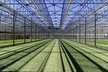
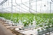
With offices in thirty countries, the company’s biological solutions are being used in 100 countries all over the world. Over the years, the family company has evolved from a pioneering concern with four employees into a global market leader. According to Martin Koppert, Chief Business Officer (CBO), it was time the branding evolves as well: ‘To make our world more sustainable, we need ways of growing that are both safe and healthy. Our goal is 100% sustainable agriculture. We work together with growers and farmers towards this goal. Our new branding will ensure a powerful image across all global markets and confirms Koppert’s unique dedication and commitment in providing a comprehensive range of biological solutions in a wide range of crops.’
‘We aim to collaborate and co-create with partners in pursuit of our mission. We believe this branding will open a world of opportunities, connecting customers and partners who are willing to contribute to a better world,’ adds Maes. ‘We are convinced that we can be part of the solution, in which we offer our knowledge, expertise, and products to produce healthy food in the most sustainable manner.’
It was essential that the new branding shows the connection of Koppert with nature. ‘Nature is where we draw all of our inspiration from, where our solutions find their origin. Obviously, our new identity is rooted in nature,’ says Maes. The Koppert ‘K’ is designed to aim forward: always looking ahead for new sustainable solutions. In addition, the symmetry symbolizes the equal importance of plant protection above and underground. The natural shapes and colors of the new Koppert brand express the connectivity with nature and the unlimited solutions which can be found in it.
For more information:
Koppert
[email protected]
www.koppert.com